
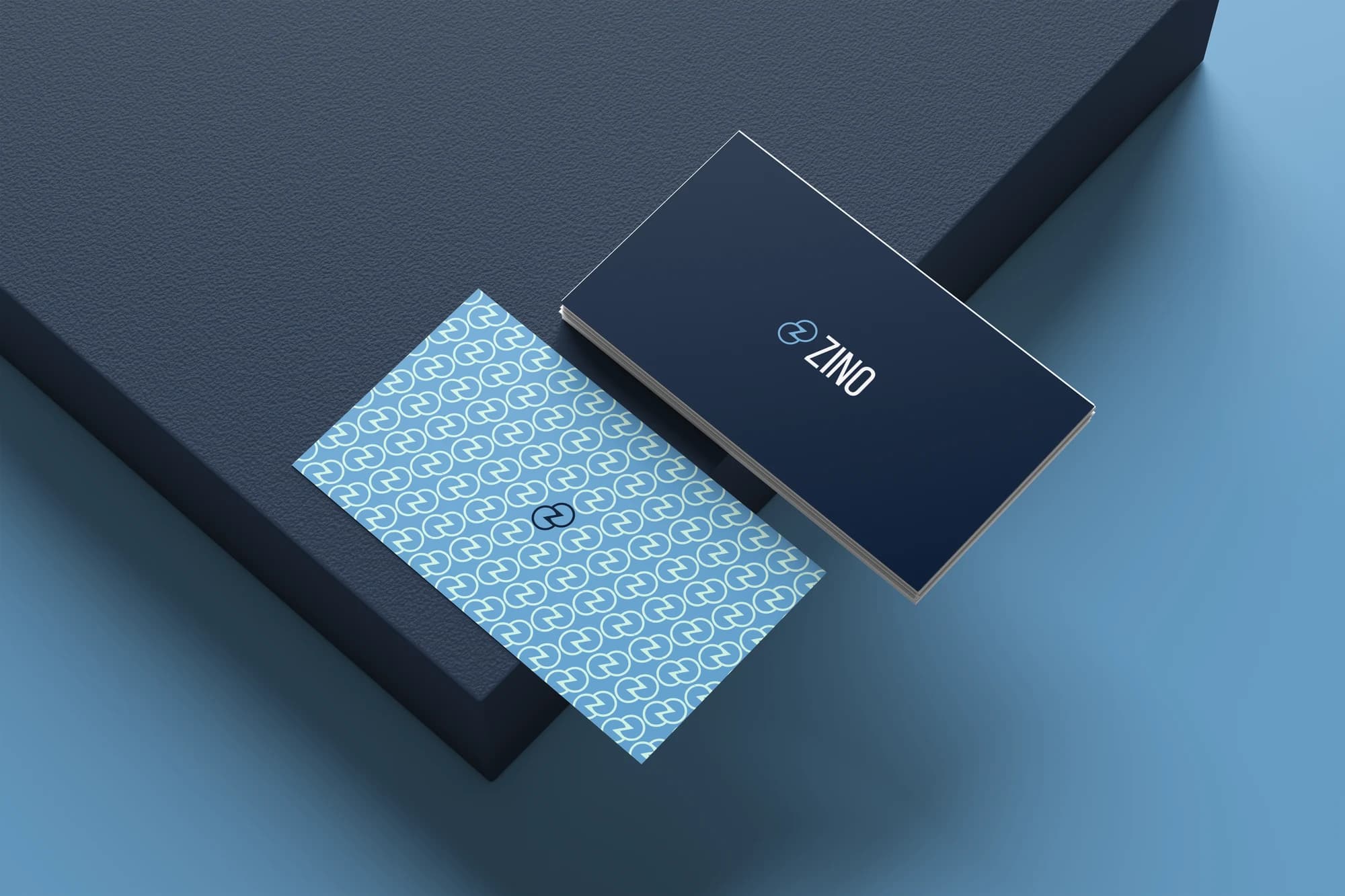
ZINO Consulting
Credibility without disappearing into sameness.
ZINO Consulting needed an identity that felt trustworthy and professional without blending into the visual conventions of the accounting world.
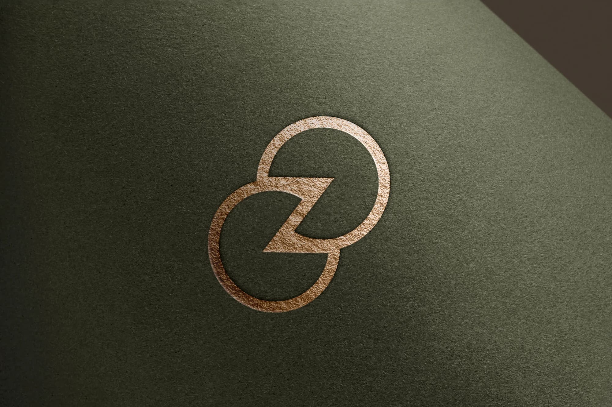
A mark with its own presence
The identity begins with a distinctive symbol. Its clarity gives ZINO a recognisable signature while maintaining a composed, professional tone.
A connected visual language
The mark extends into a repeat pattern, creating continuity between the identity and its everyday applications. Pale blue and deep navy bring contrast without visual excess.
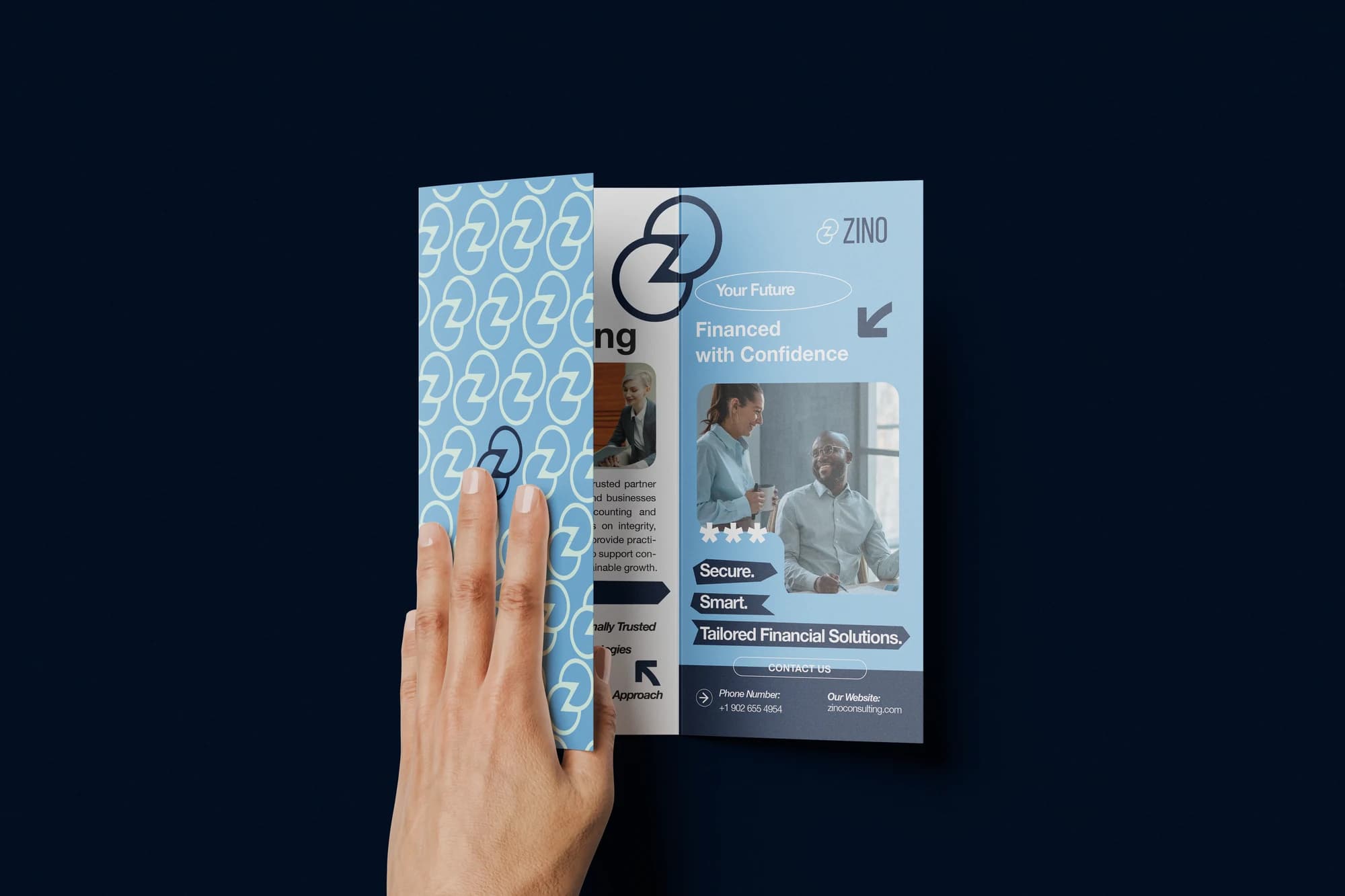
Clarity in communication
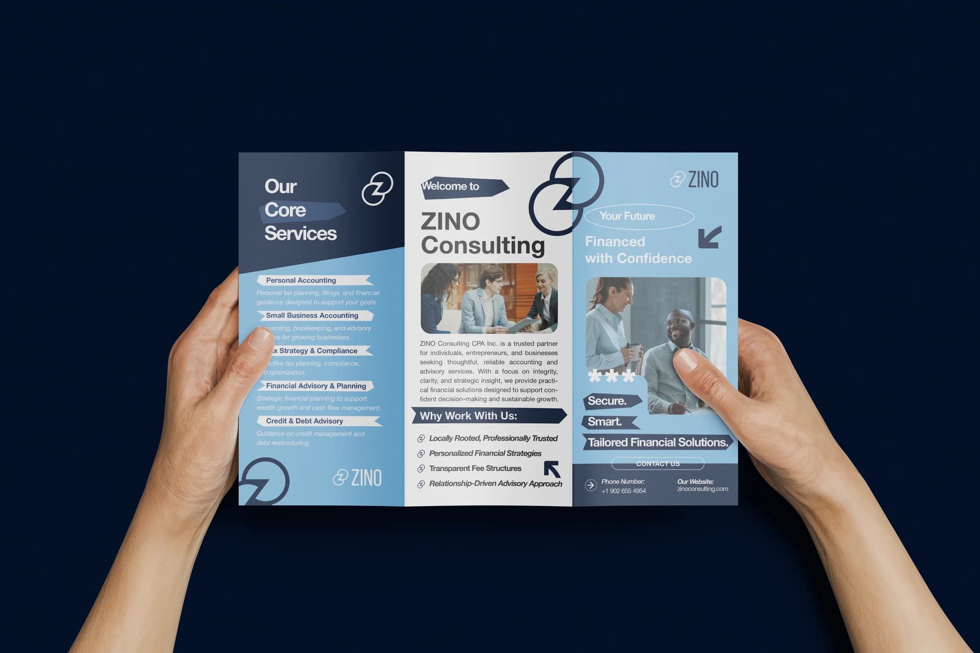
The brochure carries the system into longer-form communication. Typography, image and structure work together to keep the information accessible and the brand consistent.
Current state
A completed identity system applied across business cards and printed brochures.
- Visual Identity
- Typography
- Pattern Design
- Print Design
Credits
Client: ZINO Consulting.
CXRE Labs: brand identity, visual system and brand applications.